If you want stronger results from email advertising, your creative needs to do more than attract attention. It needs to qualify the reader, communicate value fast, and carry that momentum through to the landing page.
That matters even more in an ad network environment. Native newsletter ads have limited space, run across multiple publications, and need to make sense in different editorial contexts. Your creative has to be clear, strong, and flexible.
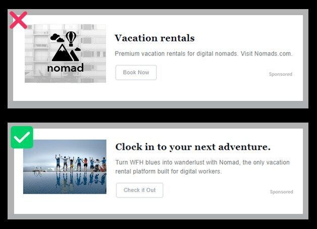
Before you launch your next ad, here's what to do and what to avoid.
What makes ad network creative different?
Newsletter ad network creative is different from both display ads and traditional newsletter sponsorships.
You have less room to work with, which means every element has to earn its place. In most cases, you get one image, one headline, short supporting copy, and a CTA.
Your ad also needs to perform across many newsletter environments at once. It should stand out, but still feel natural inside a trusted inbox experience.
Creative specs to keep in mind
For Paved Ad Network campaigns, we recommend:
- •Landscape image
- •4:3 aspect ratio
- •Minimum size: 600 x 450 px
- •Recommended sizes: 800 x 600, 1000 x 750, or 1200 x 900
- •JPG or PNG format
- •Headline: up to 60 characters
- •Body copy: up to 110 characters
- •CTA: up to 20 characters
If your image is low quality, your formatting is off, or your copy runs too long, performance can suffer before the campaign even has a fair shot.
Common creative mistakes: quick reference
| Do | Don't |
|---|---|
| Use clear, high-quality lifestyle imagery | Use cluttered visuals or low-quality graphics |
| Show people when possible | Rely only on objects, scenery, or abstract art |
| Keep image text minimal | Overload the image with copy |
| Call out the intended audience in the headline | Write broad copy that tries to appeal to everyone |
| Use specific numbers or details when relevant | Lean on vague claims |
| Give readers a clear value proposition | Assume the offer is obvious |
| Match the ad promise to the landing page | Send readers to a page that shifts the message |
| Use a dedicated landing page | Send paid traffic to your homepage |
| Put your CTA above the fold | Make readers search for the next step |
| Test multiple creative variations | Assume the first version is the best |
| Use the correct image dimensions | Upload stretched or pixelated creative |
| Be direct and trustworthy | Use clickbait or scare tactics |
A pre-launch checklist
Before your campaign goes live, ask:
- •Is the image bold, clear, and high quality?
- •Does the headline tell the right reader this ad is for them?
- •Does the body copy explain the value of clicking?
- •Is the CTA specific and action-oriented?
- •Does the landing page match the ad in both message and design?
- •Are you sending traffic to a dedicated page instead of your homepage?
- •Have you tested more than one version of the creative?
Best practices for ad creative
1. Use a bold, high-quality image
There's no question about it: your image is the most important visual element in a native email ad.
Readers make a split-second decision. A strong image helps you earn that second look.
What works
- •Use people instead of objects when possible.
Faces looking directly at the reader feel more and engaging than product-only shots, scenery, or abstract graphics. - •Match the image to your audience.
If you're targeting parents, show parents bonding with kids. If you're targeting retirees, show a recognizable stage of life or aspiration. - •Choose high-contrast visuals.
Clear, colorful, easy-to-read imagery tends to hold attention better. - •Keep the composition simple.
One focal point is usually enough. - •Test different backgrounds and styles.
A small visual shift or color shift can change how the offer feels.
What to avoid
- •Low-quality or pixelated images
- •Generic stock visuals with no clear connection to the offer
- •Images with too many competing elements
- •Visuals that rely on shock value
Quick image checklist
Before launch, ask:
- •Does this image feel relevant and aspirational to my target customer's lifestyle?
- •Is the focal point obvious right away?
- •Will it still look good at smaller sizes?
- •Is it clear, polished, and high contrast?
2. Don't add too much text to your image
Unlike some web ad formats, newsletter ad creative gets crowded fast.
If your image is overloaded with text, readers are less likely to understand it at a glance. In smaller placements, too much image text becomes difficult to read and easy to ignore.
Better approach
- •Keep text on the image minimal
- •Use the headline and body copy to carry the message
- •Make sure any text in the image is large, legible, and necessary
Why this matters
The strongest newsletter ads separate jobs clearly:
- •The image grabs attention
- •The headline communicates relevance
- •The body copy adds context
- •The CTA tells readers what to do next
When one element tries to do everything, the whole ad gets weaker.
3. Give people a reason to click with a value proposition
A strong ad doesn't rely on curiosity alone. It gives readers a clear value proposition.
That could be a free guide, a discount, a demo, a report, a product benefit, or a solution to a specific problem. If readers can't quickly tell what they get from clicking, performance usually drops.
What works
- •Lead with a clear offer
- •Use specifics to build credibility
- •Show why the click is worthwhile
- •Make the value easy to understand in one glance
| Weak value | Stronger value |
|---|---|
| Learn more | Get the free guide |
| Better banking for families | Parents of teens: compare top debit card options |
| Improve your marketing | Lower CAC with newsletter sponsorships |
| Shop now | Browse new spring styles |
4. Pre-qualify leads with a well-written headline
A great headline does more than drive curiosity. It helps the right reader self-identify.
That matters because click volume means very little if the traffic is low intent.
What strong headlines do
- •Call out who the ad is for
- •Use concrete language instead of vague claims
- •Stay concise
- •Sound credible, not gimmicky
- •Match the promise of the landing page
| Weaker headline | Stronger headline |
|---|---|
| Learn More About Retirement | Born before 1965? Here's how to make your savings last |
| Better Banking for Families | Parents of teenagers: 5 things to know before opening a debit card |
| Improve Your Marketing Results | B2B marketers: lower CAC with newsletter sponsorships |
| Next-Gen Solutions for Growth | Free guide: email strategies for higher-quality leads |
5. Body copy and CTA should add context fast
Once the image and headline do their job, your body copy and CTA need to close the gap between interest and action.
In an ad network placement, body copy should explain the offer quickly. Your CTA should make the next step obvious.
Body copy best practices
- •Say what the offer is
- •Add one useful detail
- •Keep it short and readable
- •Avoid jargon
- •Avoid filler
CTA best practices
Strong CTAs are specific. They tell readers what happens next.
Examples that tend to work:
- •Read the Guide
- •Book a Demo
- •Browse Plans
- •Get the Report
- •Start Free
- •See Pricing
Weak CTAs are usually vague or disconnected from the offer. "Click Here" and "Learn More" rarely give readers enough reason to act.
6. Don't be too wordy
Concise ad copy builds credibility and improves clarity. Wordy copy does the opposite. It makes the offer harder to understand and lowers the odds that a reader will act.
Signs your copy is too long
- •The headline feels packed or jargon-heavy
- •The body copy explains too much
- •The CTA sounds generic
- •The ad needs multiple reads to make sense
Better approach
- •Trim extra words
- •Replace jargon with plain language
- •Focus on one message
- •Make the benefit easy to spot
If you can say it in fewer words without losing meaning, do that. Running your copy through a tool like the Hemingway App is a quick way to catch excess words before launch.
7. Always match your ad to your landing page
This is where many campaigns quietly break down.
You can have strong creative and still lose the conversion if the landing page doesn't deliver on the ad's promise. One of the most common problems: sending paid traffic to a homepage instead of a dedicated landing page.
A landing page should have one clear job: move the visitor to the next step.
What to do
- •Use a dedicated landing page instead of your homepage.
Homepages create too many competing paths. - •Repeat the core message from the ad.
Consistency is key. - •Keep visual continuity between the ad and the page.
Similar imagery, language, and design reassure the visitor they're in the right place. - •Put the CTA above the fold.
Readers shouldn't have to hunt for the next step. - •Remove distractions.
Extra navigation and off-path links reduce focus. - •Warm up cold traffic when needed.
If the ask is high commitment, an advertorial or educational page can outperform a direct-response page. - •Capture lead information early for higher-consideration offers.
If conversion will take multiple touches, optimize for lead capture first.
Signs your landing page needs work
If you're seeing clicks without conversions, check for these issues:
- •The page headline doesn't match the ad
- •The offer is unclear
- •The CTA is buried
- •The page has too many links
- •The branding feels disconnected from the creative
- •The next step is too big for a first click
8. Don't use clickbait tactics
Clickbait may get attention, but it rarely gets the right kind.
Overhyped copy, sensational imagery, and misleading claims can damage trust, create a poor reader experience, and lead to weak downstream performance. They can also generate publisher complaints.
Avoid:
- •Shock images
- •Hyperbolic language
- •Misleading headlines
- •Overpromising
- •Copy that hides the real offer
Do this instead
- •Be transparent about what you're advertising and why
- •Use bold, trustworthy creative
- •Write clear, credible copy
- •Focus on relevance over drama
The best-performing newsletter ads earn clicks because they're genuinely useful to the right reader, not because they tricked someone into clicking.
Paved's Ad Network example gallery
The Paved team has mocked up some examples of ad creatives for email so you can see what works and what doesn't. *
* Not to worry—all advertisers featured in this post are 100% fictional.
Example 1:
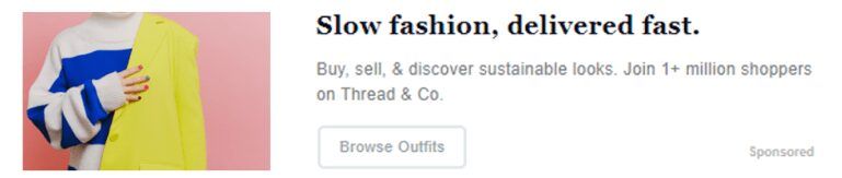
This example B2C ad has an excellent image and easy-to-read copy, giving it a great quality score. Also notable: relevant lifestyle photos of real people can actually increase ad engagement.
Why this ad works:
- •Bold, clear imagery
- •This image is eye-catching, with bright colors and high contrast.
- •It features a sharp lifestyle shot.
- •Compelling copy
- •The headline is fun and easy to read, while the body provides context for the reader.
- •Browse Outfits is a clear call to action—the reader knows exactly where this ad will take them.
Example 2:
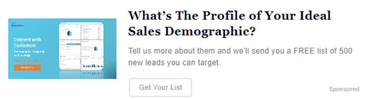
This example B2B ad has one thing going for it: the solid blue background of the image contrasts the neutral background of most newsletters. But the pros stop there.
Why this ad doesn't work:
- •Unclear imagery
This image has too much text, making it hard, if not impossible, to read. It doesn’t inspire the reader to click. - •Confusing copy
The headline is wordy and filled with jargon. Concise headlines lead to better engagement.
The body is unclear and confusing—making it hard to tell who this ad is for and what it’s offering to people who click it.
How to correct the issues:
- •Paved’s ad quality score algorithm rates this ad at 2.2/10.
- •We’d recommend replacing the image with a clear, high-contrast photo with minimal text, then adding extra clarity to the copy.
Example 3:
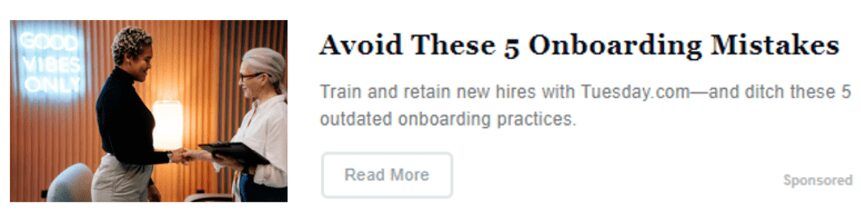
There’s a lot to like about this example B2B ad. Big, clear images like this one can boost CTR by up to 38%. Plus, the copy gives a clear value proposition for readers, inspiring them to click.
Why this ad works:
- •Clear visuals
Images like this one—with clear, bold visuals—tend to get great results. The photo of two people also helps build an emotional connection with the viewer. - •Attention-grabbing copy
The headline piques the reader’s interest compellingly. The body offers something compelling to the reader—a free guide on best practices. Offering insight can help the content feel personalized, trustworthy, and relevant. - •A solid CTA
This CTA shows the audience exactly how to act on their interest.
Example 4:
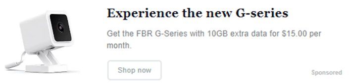
Who’s the advertiser? What kind of offer is this? Why should the readers click? We’re not sure, so this ad gets a lower quality score.
Why this ad doesn’t work:
- •A snooze-worthy featured image
The lack of color and too much white space make the image boring. - •Copy without context
Although it’s grammatically correct and concise, the copy doesn’t provide enough context or clarity. What is a G series? Why should people care?
How to correct the issues:
- •Paved’s ad quality score algorithm rates this ad at a 1.7/10.
- •We’d recommend replacing the plain white image with a fun lifestyle photo and completely reworking the marketing message.
Example 5:
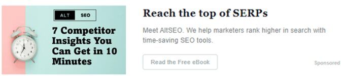
In this sample B2B ad, the CTA “Read the Free EBook” is crystal clear.
Why this ad works:
- •An eye-catching image
Although too much image text can be bad, this ad has it right. In this example, the text and logo are both large, high-contrast, and legible. The colorful graphic in the background also draws the eye. - •Bold copy
In one glance, the reader can easily understand the advertiser and what they’re all about. Plus, the value proposition on the CTA makes the ad enticing.
Example 6:
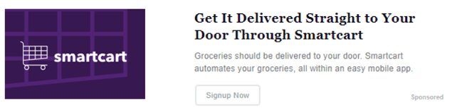
This example ad for a grocery delivery service doesn’t look bad at first glance. However, the wordy copy undermines its message.
Why this ad doesn’t work:
- •Basic imagery
Although this image is colorful and crisp, it only shows a logo. Logos are great for brand awareness, but if you're aiming to win leads or conversions with your ad, you'll need a more engaging image. - •Wordy copywriting
There are too many words that say too little. Concise headlines will lead to better engagement. Plus, there’s a common typo in the CTA: “Signup Now" should be “Sign Up Now.”
How to correct the issues:
- •Paved’s ad quality score algorithm rates this ad at a 3.5 out of 10.
- •We’d recommend replacing both the image and the copy. Ideally, this ad should include a fun image featuring grocery shopping--plus unique copy that shows why the service is better than its competitors.
- •Additionally, we'd run this copy through an online editor like the Hemingway App to trim excess words.
Example 7:
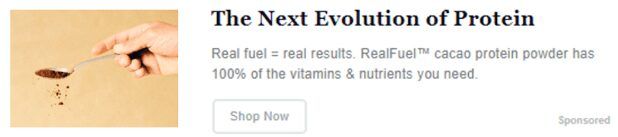
In this sample B2C ad, the call-to-action takes people to a landing page where they can shop. Ideally, landing pages should match the branding and message of the ad.
For example, if your CTA says, “Call us,” the landing page should take users to a URL that includes your phone number. Consistency is key.
Why this ad works:
- •Image shows the product in action:
The product photo in this ad is clear and effective. However, brightening up the background color could improve the image even more. - •Copy without over-complication:
This copy is informative and simple, leading the user to a branded landing page that’s tailored to the ad.
Example 8:
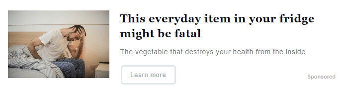
Unfortunately, this sample ad is pure clickbait.
Why this ad doesn't work:
- •Poor image
This image of a person in pain is overly sensationalized. - •Hyperbolic copy
The gimmicky headline and copy draws too much attention and will likely lead to publisher complaints.
How to correct the issues:
- •In the copy, be transparent about what you're advertising and why.
- •Use bold, high quality images that feature your product.
TL;DR
Keep in mind that these best practices are guidelines to help you produce top-quality Ad Network campaigns. The best way to know what works for you is to A/B test multiple creatives.
Try different copy, backgrounds, images, and CTAs to find out what gives you the best results.
- •Use a bold image that looks good in large and small formats
- •Avoid excess text in the image
- •Write headlines that qualify the click
- •Support the offer with clear, concise body copy
- •Use a CTA that tells readers what happens next
- •Match the ad to a dedicated landing page
- •Test multiple creative variations before scaling
Sponsor newsletters with Paved to gain more qualified leads
Join Paved to browse 2,000+ newsletters and reach over 253+ million subscribers across every niche.