Every day, most people receive over 120 emails. This includes business, personal, marketing, and even spam emails. Amidst this crowded inbox, the reader's choice to open and act on your newsletter is a significant nod of approval.
What helps people prioritize your emails over others?
- •Their connection with your brand or publication
- •The convenience of the time (Thursdays are great for email newsletters!)
- •The urgency or the time-sensitive nature of the email
- •The significance of anticipated news or updates
- •A fantastic newsletter design
This last point can often beat newsletter fatigue for most consumers.
The truth is, your audience may not always be waiting for an event update. They may also ignore some of your newsletters (regardless of how much they love you) if they are particularly busy. But if they know you already, and know that your newsletter is going to be short, sweet, and a delight to read, you can count on your CTRs rising.
The benefits of a well-designed newsletter
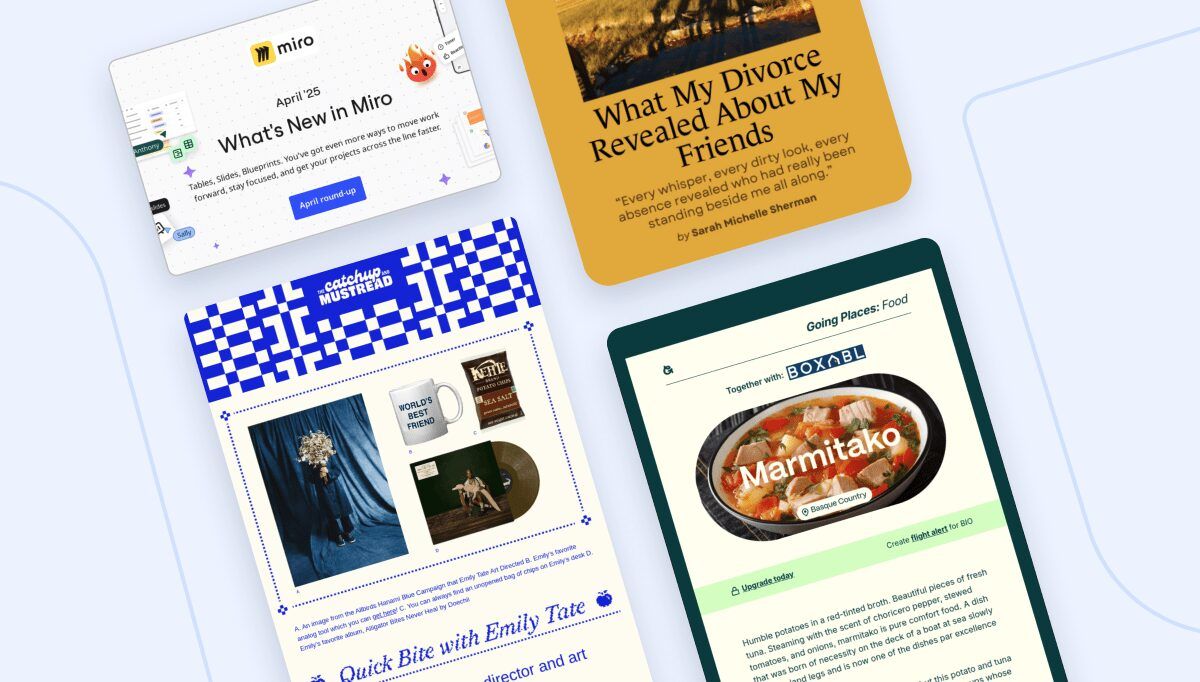
Humans are naturally drawn to compelling visuals. We equate sophisticated graphics, impactful photography, and striking illustrations with high quality. Conversely, subpar design can be off-putting, while an aesthetically pleasing one tends to garner our attention and confidence.
Here are several strategies to enhance the effectiveness of your newsletter through exceptional design:
- •Improve business credibility. Great-looking designs instill trust in consumers and make brands look more credible.
- •Provide a better reader experience. Emails properly segregated into sections, with efficient visuals, and engaging copy are easier to read and skim.
- •Provide better user engagement. Emails that contain animation or video enjoy more user engagement.
- •Ensure higher mobile open rates. Mobile-responsive emails can increase open rates on mobile by up to 15%.
- •Influence emotions. Colors and shapes carry inherent meanings which they transfer to brand characteristics thus influencing consumer emotions and behaviors.
To make the most of what design can do, you have to get the basics right. What are the essential components of an email newsletter? What goes into creating a marketing email that people will consistently like to open and engage with?
Let’s find out.
The 8 vital organs of email newsletter design
While the details and specifics vary across industries and campaigns, the fundamentals of good newsletter design remain the same. Here they are:
1. Subject line
For most people — 64% of them — it’s the subject line that does it. If it’s appropriate in length and conveys the gist of the newsletter content in the most effective way, it’s going to get your email opened!

As you can see from the excerpt above, the subject lines have sufficient length variations. You can even spot an emoji in there and that one doesn’t even show the preheader text. But does the subject line tell everything I need about the email content?
You bet.
A study by GetResponse, an email marketing software company, asserts that though the character count matters, the open rates depend mostly on the relevancy of the subject line. If the subject line is strong and matches the content inside, you’ve conveyed value to your audiences and they’ll likely trust your future emails too.
Still, to ensure your character count is optimal, iPhone cuts it at 48 characters and Gmail at 37.
But is it only length and relevancy that matter? GetResponse analyzed the use of emojis and personalization in subject lines too but didn’t find significant differences in their A/B tests. If anything, addressing people by their first name is not the norm anymore. 88.52% of marketers don’t even do it the CRT of their emails is 2x higher than those who add user names in subject lines.
Does it mean you should avoid adding emojis and not personalize your subject lines anymore?
Not even a little bit. The point is to pay more attention to personalizing the content. Understand your customer, find out what they are looking for, tailor your newsletter to suit their interests, and deliver value.
Tips to create a great subject line:
- •Optimize your email subject line development with the help of AI tools and generators.
- •Strive to create subject lines that deliver value to unique users leveraging hyper-personalization.
- •Always A/B test your emails across metrics to create personalized, dynamic newsletter campaigns.
2. Preheader text
This is the text users see right under the subject line before they open the newsletter. It supports your subject line and provides a preview of what the newsletter is about. Email newsletters that contain a preheader enjoy higher open rates and higher CTRs too.

While it’s okay to not be too finicky about the length of the subject line, preheader text requires more care. The usual word limit is between 40-130 characters but most email clients clip the text at 100 and pull content from the newsletter body if the preheader is less than 30 characters.
So where’s the sweet spot?
Aim for the 30-80 mark for the most efficient preheader text.
Tips to create a great preheader text:
- •Ensure it is different than the subject line. Do that by giving more details of what the newsletter is about, or highlighting a trending section of it.
- •Establish harmony between the two. While different in language and details, together they must tell a cohesive story.
- •Include action words in the preheader so your customers have a clear idea of the value they’ll derive from the newsletter.
3. Header
Your newsletter’s header is the first thing people see when they finally open the email. It has to grab attention, do it quickly, and maintain it. Striking colors, an attention-grabbing headline, and your company’s logo are the usual parts of the header design.
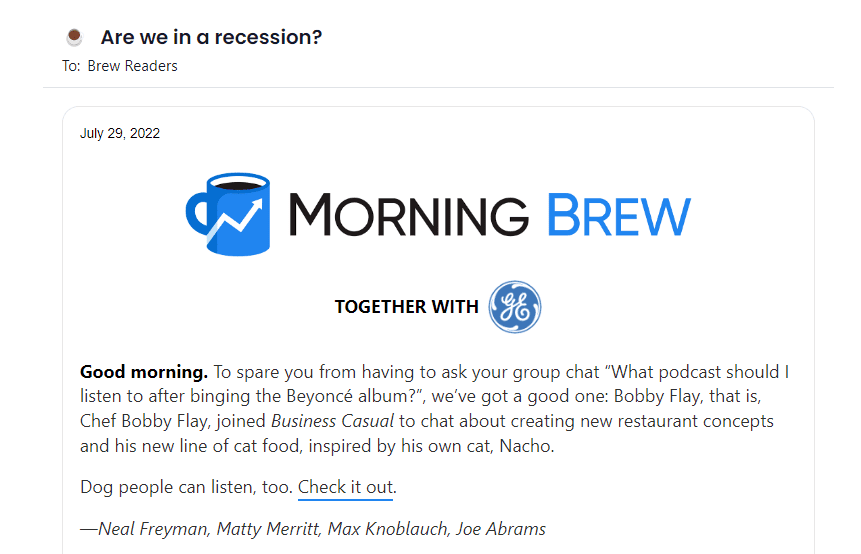
The logo is critical because it achieves multiple goals:
- •Assures audiences that they are viewing a branded asset and not just opening a spam email.
- •Allows you to showcase your brand in all its glory.
- •Helps guide design choices so even though there are bits and pieces of variations, the underlined theme is consistent and balanced.
Since you don’t have a lot of time before a user potentially abandons the newsletter, striking and attention-grabbing visuals help maintain the focus.
Tips to design a great header:
- •Use a color palette different from your brand colors but in the same visual language and style.
- •Come up with a catchy headline so it’s not just colors pulling the cart.
- •Brand the newsletter by placing your logo on top.
4. Email copy
While the design is the hero of your newsletter story, the content inside is the mission that drives the story forward. You do a great disservice to your newsletter when you pepper it with uninspiring jokes, flat vocabulary, and gimmicky CTAs.
As you're writing your newsletter, bear in mind that people are probably reading it on the go. Plus, your purpose is not to impress them with how well you write, but how effectively. Be genuine, remain on-brand, and if you do make some flat jokes, remember to call yourself out in the content.
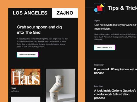
Zajno — a design studio in Los Angeles, CA — uses simple but effective copy for its newsletter. There are no frills, no witty statements, and no wordy philosophy. Just design goodness sent twice a month.
What I especially like about this newsletter is their CTA copy. Where most brands and publications get a bit sales-y here, Zajno remains unfazed and flawless.
Tips to write a great newsletter body text:
- •Deliver what you have promised in the subject line. Provide information, details, and resources to explore more.
- •Consider your brand voice to create copy that resonates with your audiences.
- •Follow a visual template so you know when and how to split up the text to match the purpose of the newsletter.
5. Visuals
Visuals in a newsletter refer to the media you add in there. Depending on your industry, audience, and purpose of the newsletter, you could add a variety of media assets. Videos and animation work perfectly for youth-focused and child-oriented marketing. Illustrations are ideal for newsletters containing tutorials or processes. Marketing materials advertising a new product or behind-the-scenes footage should leverage original graphics to showcase the actual product.
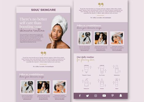
EXCERPT OF A SKINCARE BRAND NEWSLETTER FROM DRIBBBLE
The purpose of visuals is multifold in the newsletter:
- •To break large text blocks
- •To illustrate examples, offers, and events
- •To add visual interest and the delight factor
Original graphics help achieve these goals more than stock images. While stock images have their uses (during budget constraints and when original photography isn’t possible), keep them to a minimum. Compared to original creatives, stock imagery is perceived as fake and less than. It also conveys laziness on the brand’s part, and do I need to say that you should avoid such a tag?
Tips to include the best visuals:
- •Always use responsive and optimized graphics. Mobile-friendly and quick-to-load newsletters get the most love.
- •Only use high-quality crisp images. Remember, visuals convey brand quality.
- •Keep the layout clean. Visuals are pretty but if there isn’t any hierarchy to them or they make the reading experience clunky, nobody will stick around to soldier through the text.
6. Call-to-Action buttons
Everything you have done so far has brought you to this point. People have been enamored by your subject line, dazzled by the visuals, and inspired by the copy. Is that enough for them to act and click on that ‘Buy’ or ‘Download’ button?
Not if those buttons literally say those words.
Remember that your call-to-action buttons aren’t a means to an end. They are a continuation of the conversation. If you have played your cards right so far, the CTA looks natural, perfectly placed, and organic sounding.
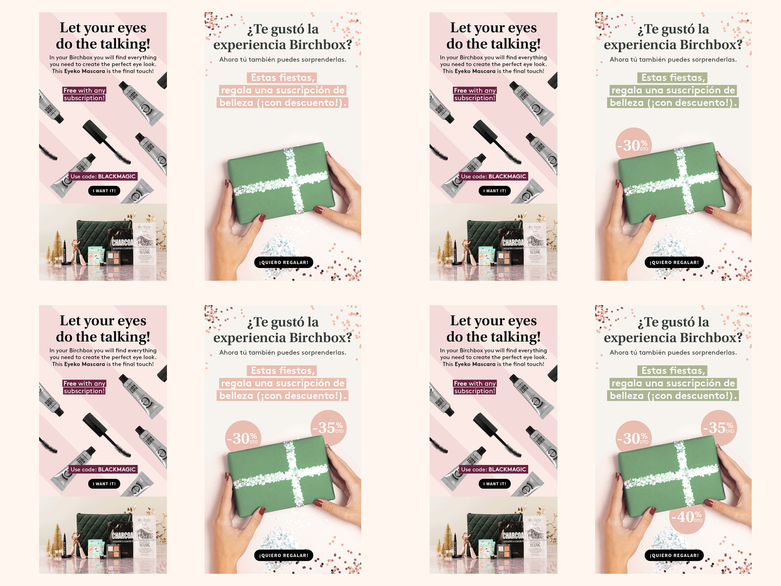
Give your CTAs personality, add wit, and be strategic about their placement. If your newsletter is about one thing and one thing only, a single CTA is ideal. However, if sending an info-rich recap with teasers of multiple articles and news, each section could benefit from a focused, targeted CTA that helps you convert for that section.
What are some other CTA best practices that can help? See below. For serious CTA inspiration, Brevo (formerly Sendinblue, a marketing CRM software) shares over 100 CTA newsletter examples.
Tips to design great CTA buttons:
- •Too obvious but still significant: always lay out a clear action in the CTA. Keep it active voice and leverage specific words like ‘join’, ‘subscribe’, ‘buy’, ‘get’, and similar.
- •No fancy words or witty jokes in the CTA. Keep it simple and on-brand.
- •Make the CTA bold, noticeable, and inside a visible button so it stands out and draws focus.
7. Footer
This is typically the least exciting part of a newsletter but it doesn’t have to be. Instead of ending the newsletter with a standard copyright button and the customary social media icons, use this space to end your conversation on a high note!
- •Say a personal goodbye,
- •leave a surprise discount that only people who read to the last will get, or
- •leave your customer support information so customers can quickly get in touch
- •Share your online payment options
- •Brag about how many subscribers you’ve already got (social proof!)
- •Insert testimonials
- •Or even a last call-to-action with no distractive frills.
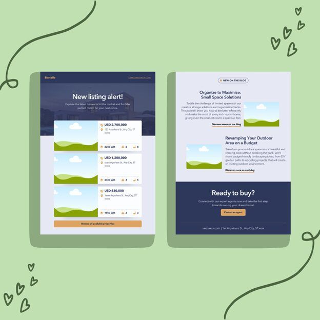
Remember that a newsletter footer is different from an email signature. A business email signature design is more compact and preferably simplified. It includes your name, company information, and your personal social profiles. With a footer, you need to think brand, campaign, and marketing.
Tips to design a striking footer:
- •Optimize your footer for mobile devices so the design remains intact regardless of screen size.
- •Avoid cramming the footer with info. Use sections, margins, columns, and white space to organize the footer design.
- •Include the Unsubscribe link and make it clear, visible, and appropriately placed.
8. The Unsubscribe link
If you have been sending newsletters for a while, you know the effort it takes to amass an email list. You do not want anyone leaving, do you?
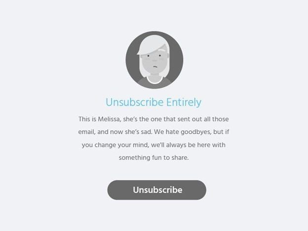
Well, we may not like people unsubscribing from our newsletters, but a bloated email subscriber list does more harm than good to a publication or brand.
- •It tells ESPs that your emails don’t have what it takes to interest the readers. It can affect your deliverability rates, likely pushing your emails to be filtered out.
- •It requires you to spend on resources (server capacity, for example) to maintain a fat email list that does nothing for the brand.
- •Your ROI can hurt, impacting the overall success of your campaigns.
- •You can’t judge the metrics accurately. A low open rate may only be because you have more inactive subscribers than you know.
The Unsubscribe button, therefore, is your ally and best friend. If you are strategic about it, can streamline your user experience, keep your lists neat and tidy, and let you remain legally compliant (if you’re new to email marketing, it’s illegal in the US and EU to send marketing emails without prominent opt-out options).
Tips to get the Unsubscribe link right:
- •Ensure it is always an easy-to-find link.
- •Allow them to Unsubscribe quickly (be nice!) and give the option of doing it more all lists with a single link.
- •After the Unsubscribe window, take their feedback to learn what drove them to it and how you can improve. Keep it simple. A short text box is enough.
The anatomy of a newsletter design: Understanding the basics
When it comes to newsletter design, these are the handful of components that you’ll work with regularly. So nailing them down is critical for sustainable newsletter success. It will improve your open rates and CTRs and earn you distinction too.
When you get the basics right, you gain the confidence to bend some of these rules, break through the noise, and stand out.
Once the design has been perfected, platforms like Paved can take it from there and help you monetize and grow.
Get sponsorships from world-class advertisers
Work with premium advertisers, fill ad space, and optimize your sponsorship bookings at scale.

This guest post was written by Karla Hogan. Karla is an accomplished writer and blogger with a degree in marketing. With over 5 years of experience in writing strategic content, she has worked with startups and founders, helping them to develop and execute effective content strategies that deliver results. Karla is known for her ability to craft compelling content that resonates with readers and drives engagement. She has a keen understanding of the power of storytelling and how it can be used to build brands and connect with audiences.